Design documents outline how a game will be designed, it’s something both for developers to consult during the process and to show to publishers. Naturally that makes the design docs for well known games a great learning resource.
For example Masahiro Sakurai, the director of the Super Smash Bros series, uploaded a video where he discussed the development of the original Super Smash Bros. Included in this were brief and tantalizing glimpses of the design document, which I proceeded to take screenshots of.
Looking at those screenshots will let us see the design of Super Smash Bros at its most basic, before it became the game that defined the term platform fighter.
Now it’s time to dig into what we have of this document.
I’m unsure if the title page we see here was what was literally presented, but let’s assume it was or that exact terminology was used right away on the unseen page one.
Right at the start the proposal must have sounded quite wild for its time, with two deviations from standard fighting game design. Not only is the player count changed from two to four, which sounds cluttered for a fighting game, but the removal of health bars immediately prompts the question of how you win the game. These days, both could be conveyed by saying ‘platform fighter’ or ‘its like Smash Bros.’
On the second page we see the design for stages laid out. They’re more involved than your standard fighting game stage, hazards are even stated to be a key part of the game.
With the pictures we see one stage set on girders up in the skyline of a city, and a stage that’s a bridge in a mountain range. The girder stage makes it clear you’ll need to jump to navigate some stages in the game, while the bridge stage shows off how vast the stages can be.
These specific stages didn’t make it into the final game, but they fulfilled their role in demonstrating the range that Smash Bros stages have. We salute you, unnamed girder stage and unnamed mountain bridge stage.
The win condition is laid out on page three, victory by ring out. This was already a win condition in some 3D fighting games, but not the main or only one. The damage percentage system shown in the document is already in the exact form all Smash Bros games would use it in, Super Smash Bros Ultimate is so far the only game to have made even a minor change to it by showing an additional decimal value.
You can even see a fundamental rule of Smash Bros described outright in the bottom of the screenshot, even with no damage taken you can still get eliminated if you screw up badly enough.
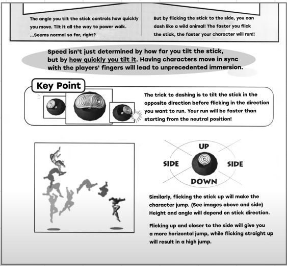
Page four is about the movement, and there’s something important to keep in mind about the context of this game. The N64 was the first Nintendo console to use a control stick. Obviously arcade games had already been using them for a long time, but for Nintendo’s developers this was something new to make use of, rather than how things have always been.
Most fighting games like Street Fighter had six buttons for players to make use of, the N64 controller had two face buttons. Letting the same button be used for two different attacks helps make up for that difference. And it’s likely this solution was devised precisely because the control stick was a new console feature to play around with.
This also shows that Smash Bros’s three types of grounded attacks were clearly defined at an early stage. Considering this was a document used by a Japanese development team I’m assuming we’re reading a translation made at least fairly recently, but I find the possibility that the game’s name came from a type of attack interesting. I would have assumed the Smash attacks were named after the title was decided.
Even now with the series having moved to systems with a greater number of buttons to use, the tilt/smash controls remain. The two button system of Smash Bros is a reminder of its N64 origins. Any attempt to ‘shake up’ the formula of a Smash Bros game should take that into account and compare it with what can be done on modern controllers.
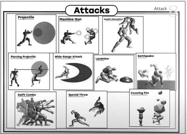
There are barely any words on this page (note this is page eight, the last page number was four), but what we see is still interesting. A wide range of different attacks are on display, some of which didn’t manifest in the games until years later.
The landmine attack would go unused until Solid Snake joined the Brawl, while Robin brought the concept of a health absorbing attack to Smash Bros Wii U/3DS in a rather different form, rewarding attacks from behind the opponent.
In this prototype form Smash Bros, or Dragon King as it was called then, wouldn’t feature established Nintendo characters. So these moves weren’t intended to be fitted onto already known characters. What characters could have been created from using these moves to fill out a roster?
I would have loved to hear how the design of Smash Bros changed once it was decided to make it a Nintendo crossover game. Were there any failed attempts to preserve some of these attacks that didn’t make it into the game? Is Snake’s C4 entirely because it fits him or was it a deliberate revival of a scrapped move concept?
Looking at the Whole
It’s reassuring to me how obvious the placeholders in pictures are in their status as placeholders. My inability to create anything visual often feels like a fatal weakness, but I think I have enough tools and knowledge to make a design doc now. There’s also something to learn from how none of the specific stages and attacks made it into the game as they appeared here, but the fundamental controls did.
Some notable exclusions in what we see of the design document are the special and aerial moves. There are at least a few pages we know for sure that we did not see thanks to the page count, so there’s a high chance they were outlined on one of them. I imagine there also had to be at least one full prototype moveset to demonstrate the range of attacks characters would have.
Reviewing and contemplating these pages of the design doc gives me a deeper appreciation for how Smash Bros is designed. I grew up playing Super Smash Bros Melee, the second Smash Bros game, so the rules of the series were simply what they were to me. Now I’m better able to comprehend the process of its creation and the reason those rules were made.
When I outline my own game ideas, I’ll most certainly be referring back to this as reference material.


This was a fascinating deep dive! Love seeing early design docs for well-loved things.
What's interesting with this game is how spot on they were with the evolution of winning and moves. I grew up with the power bar, and the idea that the percentages were not an indicator of winning or losing confused the heck out of me. However, it made total sense to my son, who proceeded to destroy me. All the moves were based upon mechanics I couldn't get used to... also pleasing my son a great deal 😂